
What a deployment assurance dashboard should actually tell you
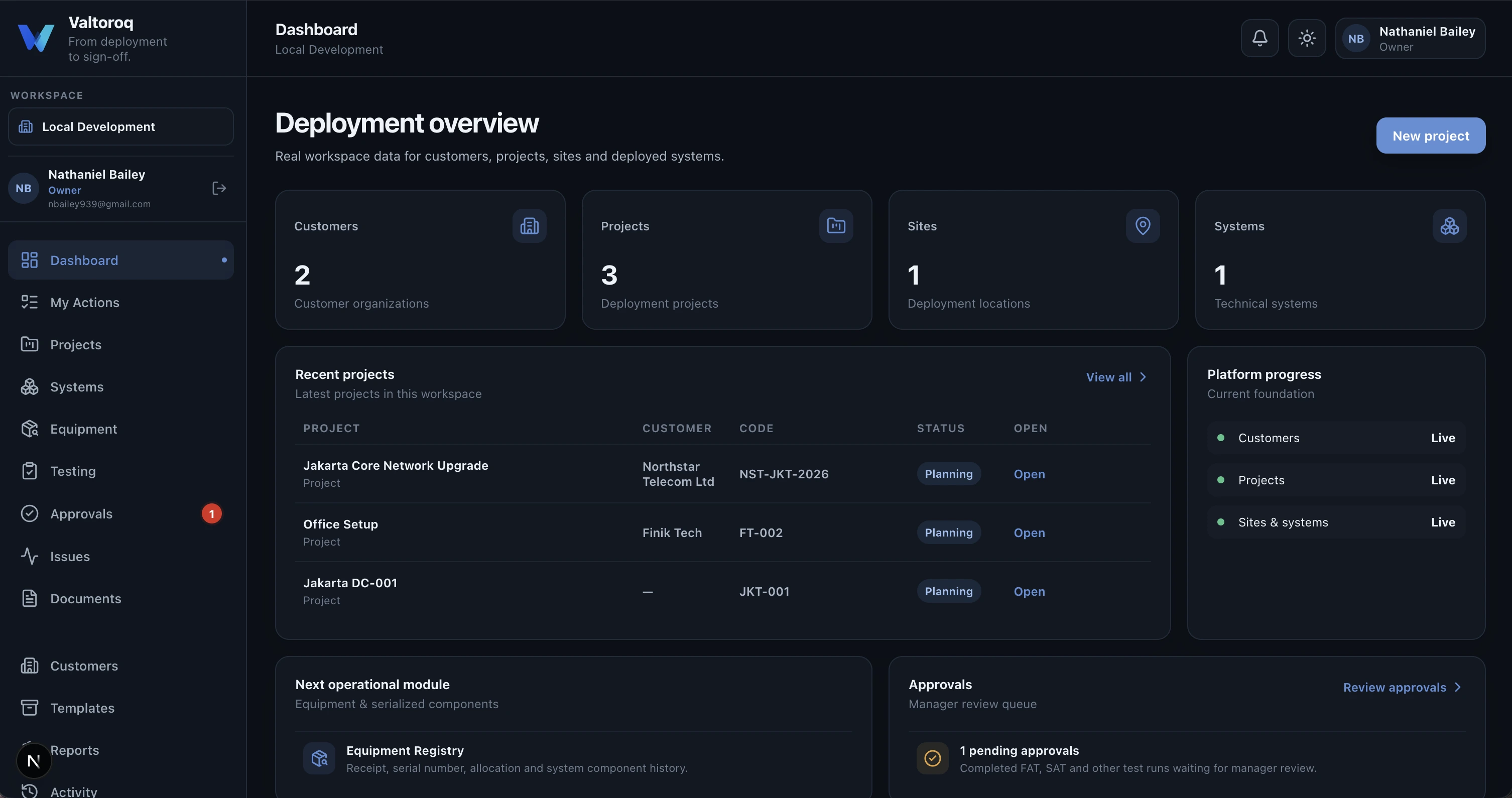
Dashboards are useful when they help a delivery team decide what needs attention next. A deployment dashboard should not celebrate activity for its own sake. It should answer whether systems are ready, which tests are incomplete, what is blocking acceptance, who owns the remaining work and where the project is accumulating risk.
Activity is not the same as readiness
A project can contain hundreds of completed activities while a single unresolved issue still prevents customer acceptance. Counting records without showing their operational meaning can create false confidence. Deployment assurance needs a different type of summary: one based on readiness conditions rather than activity volume.
The questions a useful dashboard should answer
- How many systems are deployed and how many are ready for the next stage?
- Which systems currently have failed or incomplete tests?
- How many open issues are blocking acceptance?
- Which approvals are waiting for action?
- Are any sites accumulating more problems than others?
- Which projects have approaching deadlines with unresolved work?
- Can the user drill directly from a summary into the affected record?
Make blockers visible before they become deadlines
The most valuable information is often the exception. A failed SAT, an issue without an owner or an approval that has been waiting for several days deserves more attention than another completed test. The dashboard should make those conditions visible while there is still time to act.
| Signal | What it should tell the team |
|---|---|
| Failed tests | Which systems cannot yet progress and why |
| Open issues | Who owns remediation and whether retest is required |
| Pending approvals | Where a completed activity is waiting for a decision |
| Acceptance readiness | Whether technical and documentary prerequisites are satisfied |
| Site comparison | Where defects or incomplete work are concentrated |
Drill-down is more important than decoration
A polished chart is useful only if it helps the user reach the underlying problem. If a project manager sees that twelve percent of systems have open issues, the next action should be one click away: show those systems, show the issues and identify the owner.
This is why Valtoroq treats the dashboard as an operational entry point rather than a presentation layer. Summary cards and readiness views should connect directly to project, site, system, test and issue records.
Different roles need different levels of detail
- Project manager
Needs readiness, blockers, overdue actions and acceptance status across the project.
- Engineer or technician
Needs assigned tests, issues, remediation tasks and the records required to complete the work.
- QA or approver
Needs completed evidence, exceptions and items waiting for review.
- Customer stakeholder
Needs a controlled view of readiness and acceptance without internal operational noise.
What Valtoroq is designed to surface
Valtoroq connects the dashboard to the operational records underneath it. Projects, systems, tests, issues, approvals and acceptance status are not separate reporting exercises. They are parts of the same delivery model, which means the dashboard can show the state of work instead of relying on manually updated status slides.
For smaller organizations, that can remove a surprising amount of administrative effort. A team should not need one spreadsheet for deployment status, another for test results, another for defects and a weekly meeting just to reconcile them.